No products in the cart.


Picture your ideal home office. It’s more than just a place with a desk; it’s a space that feels like an extension of your best, most productive self. This is a room that actively fuels your focus and sparks your creativity every time you walk in. The right home office color schemes are about so much more than what’s on-trend—they’re about fundamentally changing how you feel and work throughout the day.
This isn't about just painting walls. It's about making a strategic choice to build an environment that truly works for you.
Think of your color palette as one of the most powerful tools in your productivity arsenal. Since so many of us started working from home, color has evolved from a simple aesthetic choice into a real, measurable productivity tool. It’s fascinating stuff. A well-known global survey, for instance, found that 42% of people name blue as their favorite color, linking it to feelings of trust and stability. This is why designers so often recommend shades of green for study spaces—it’s been shown to help with concentration. You can even explore the data on worldwide color preferences and see how these connections pop up across different cultures.
This guide is your roadmap to creating a space you’ll genuinely love walking into every single morning. We’ll dive into how to build a palette that elevates everything you do, from the paint on the walls to the smallest accessories on your desk. The goal? To create a true sanctuary for productivity and inspiration.
The first step is a mental one: recognize that your office is a distinct zone with a specific job to do. It’s not just a spare corner; it's a dedicated area for focus, deep work, and big ideas. A well-designed color scheme is key to supporting this mission by creating clear psychological boundaries. When you step into that space, the colors should send a clear signal to your brain: it’s time to get to work.
Your office’s color palette isn't just decoration—it's a silent partner in your professional success, helping to minimize distractions and maximize your output.
Whether you're carving out a small nook or dedicating an entire room to your work, the core principles are the same. The right combination of shades can make a tiny area feel more expansive and open, or a large, drafty room feel cozier and more contained. If you want to dive deeper into the nuts and bolts of a great workspace, check out our complete guide on how to set up a home office.
Ready? Let’s start transforming your workspace with intention.
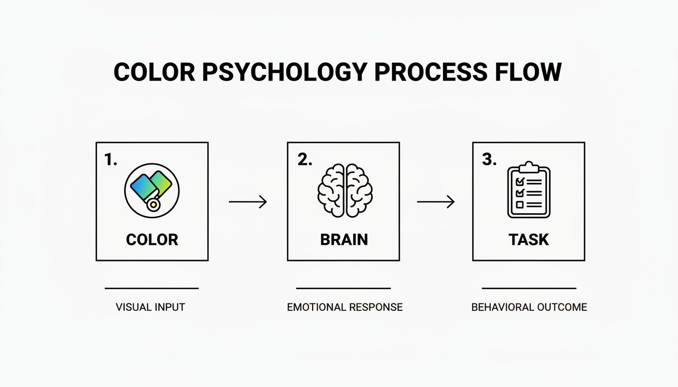
Ever notice how a color can completely change the feel of a room? It's not just in your head. Every shade has its own personality, sending subtle cues to your brain that can either rev you up for a brainstorming session or help you settle in for deep, focused work. Think of your home office palette less as decoration and more as a silent partner in your success.
Some colors are like a shot of espresso—think vibrant, energetic yellows that get your creative gears turning. Others are more like a calming cup of chamomile tea. The cool, steady presence of blue, for example, is famous for helping us concentrate, which is why it’s such a go-to for tasks that demand serious brainpower.
This goes way beyond just "feeling good." The right colors can genuinely boost your performance by reducing eye strain, cutting down on mental fatigue, and keeping your mood elevated all day long.
The real secret is aligning a color's psychological vibe with the work you actually do. A graphic designer's ideal creative space will look and feel completely different from a financial analyst's, and that's exactly how it should be. The goal is to be intentional about the atmosphere you're building.
Your home office palette is a powerful productivity tool. When you match a color's innate energy to your workflow, you create an environment that doesn't just look good—it works as hard as you do.
So, where do you start? First, think about what your most important tasks demand from you. Do you need to feel inspired and let ideas flow, or do you need to block out the world and focus?
For Analytical and Detail-Oriented Work: Cool colors are your best friend here. Shades of blue and green create a calm, serene backdrop that helps the mind zero in on complex information without getting sidetracked. They're perfect for programmers, writers, and anyone who deals with data.
For Creative and Collaborative Tasks: If your job is all about big ideas and teamwork, warmer colors can light that fire. Soft yellows, gentle oranges, or even a strategic pop of red can spark conversation and innovation, making them ideal for marketers, designers, and entrepreneurs.
For a Balanced and Calming Atmosphere: When work gets stressful, grounded, earthy tones can be a sanctuary. Neutrals like beige, taupe, and soft gray build a stable, soothing foundation that helps quiet the noise and reduce anxiety.
I know, choosing the perfect color can feel a bit daunting. To make it easier, I've put together a quick reference guide that connects common colors to their psychological superpowers. Think of it as a cheat sheet for building a workspace that truly works for you.
| Color | Psychological Effect | Best For | Blu Monaco Collection Match |
|---|---|---|---|
| Blue | Promotes calmness, logic, and trust | Deep focus, analytical thinking, and strategic planning | Aqua or Teal collections for a modern, focused feel |
| Green | Reduces eye strain and fosters balance and refreshment | Long work sessions, reading-intensive tasks, and restorative focus | Natural Wood or White collections paired with live plants |
| Yellow | Sparks optimism, creativity, and energy | Brainstorming, creative problem-solving, and collaborative work | Gold collection for a touch of inspiring warmth and elegance |
| White | Creates a sense of clarity, spaciousness, and minimalism | Small spaces, minimalist aesthetics, and tasks requiring a clean slate | Classic White collection for a timeless, organized look |
| Black | Conveys sophistication, power, and seriousness | Executive spaces, tasks requiring authority, and creating contrast | Sleek Black collection for a powerful and polished statement |
This table is just a starting point, of course. The most important thing is to choose a palette that resonates with you personally while supporting the unique demands of your work.
Alright, ready to step into the designer’s seat? Creating a color scheme that feels both professional and deeply personal is way more achievable than you might think. The real secret isn't just picking one color you love; it's about building a balanced, three-part palette.
Think of it like getting dressed for a big presentation. You don’t just throw on random items. You build an outfit with intention.
Your dominant color is your foundational piece—the perfectly tailored suit or the classic dress. It's the color that will cover the most ground, usually your walls, and it sets the entire mood for the room.
Then you have your secondary color. This is the crisp shirt or elegant blouse that complements your main piece. It should cover about half as much space as the dominant color and works beautifully for larger furniture, an accent wall, or a statement rug.
And finally, the best part: your accent color. This is your flair—the silk pocket square, the bold piece of jewelry, or the designer watch. You use it sparingly, but it packs a serious punch, injecting your unique personality and a dash of visual excitement into the space.
There’s a classic interior design principle that pros swear by, and it's called the 60-30-10 rule. It’s a simple, foolproof ratio that ensures your colors work together in harmony, creating a visual flow that feels naturally right and never overwhelming.
This isn't just about making things look pretty. As you can see, the colors you choose have a direct line to your brain, influencing your focus and drive.
A thoughtful color palette can literally trigger the mindset you need to get things done. Here’s how you put the rule into action:
60% Dominant Color: This is your anchor, covering about 60% of the room. It’s the main event, so think walls or a large area rug. This shade should reflect the core feeling you want for your workspace—calm, energized, creative, you name it.
30% Secondary Color: Your supporting act. This color should take up roughly 30% of the visual real estate. It needs to create a pleasant contrast while still vibing with your dominant hue. Perfect for your desk, a bookshelf, curtains, or an accent chair.
10% Accent Color: This is where the magic happens! The final 10% is all about personality. This is your pop of color, used for high-impact accessories like desk organizers, artwork, a cool lamp, or a throw pillow.
The 60-30-10 rule is more than a guideline; it's a recipe for success. You're not just choosing colors—you're strategically placing them to create a space that feels intentionally designed and professionally polished.
Let's walk through a real-world example. Say you’re craving a workspace that feels focused but also serene. You could start with a soft, calming gray on the walls (60%). To add some depth and sophistication, you might bring in a rich navy blue for your desk and main shelving (30%).
Then, for that final touch of brilliance, you could sprinkle in accents of warm gold using a Blu Monaco desk set and a few elegant picture frames (10%). See how it all comes together?
This structured approach takes the guesswork and anxiety out of the design process. It empowers you to mix, match, and experiment with total confidence, guaranteeing a final result that’s not just beautiful, but perfectly tuned for your best work.
Alright, we've covered the building blocks. Now for the really fun part—seeing how it all comes together. To get your own creative wheels turning, I’ve put together a few professional-grade color schemes designed for specific work styles. Think of these as proven recipes for a productive atmosphere, ready for you to adapt and truly make your own.
These aren't just pretty combinations pulled out of a hat. Each palette is a strategic mix, thoughtfully chosen to spark a certain mood and support a specific kind of work. You'll see exactly how a base, secondary, and accent color can create a powerful and cohesive space.
This one is built from the ground up for intense, uninterrupted focus. It’s the perfect backdrop for programmers, writers, analysts—really, anyone who needs to shut out the noise and dive deep into complex tasks. The entire goal is to create a space that feels like a protective cocoon, silencing the outside world so you can get into that flow state.
Dominant Color (60%): A rich, deep navy blue on the walls. This color is serious and incredibly calming, helping to lower your heart rate while encouraging clear, logical thought.
Secondary Color (30%): Warm, natural wood for your desk and shelving. This is a crucial touch that adds an element of grounding warmth and sophistication, keeping that deep navy from feeling cold or stark.
Accent Color (10%): A touch of polished brass or gold. A subtle gleam from a lamp, picture frames, or a Blu Monaco Gold Desk Set brings in just the right amount of classic elegance and light.
This combination creates a quiet, almost stately environment that tells your brain it’s time to concentrate. The dark walls seem to fall away, helping you forget the room itself and focus completely on what’s in front of you.
Designed for brainstorming, innovating, and thinking outside the box, this palette feels bright, airy, and full of possibility. It’s absolutely perfect for graphic designers, marketers, content creators, and entrepreneurs who thrive on high energy and fresh ideas. It’s all about creating an atmosphere that feels light and inspiring.
This approach lines up perfectly with where professional design is headed. Trend forecasts from industry leaders are pointing toward earthy greens and deep blues for workspaces. As top interior designers have pointed out, shades like olive and teal are becoming some of the "hottest hues" because they feel both calming and "regal and majestic." You can learn more about the leading color trends for 2025 and 2026 to see how these shades are shaping modern interiors.
Dominant Color (60%): Crisp, clean white on the walls. This is your blank canvas. It maximizes every bit of natural light and lets your creative thoughts take center stage without any visual clutter.
Secondary Color (30%): A soft, muted teal or sage green. Use this on a single accent wall or for a statement piece like a bookshelf. This gentle touch of color is incredibly refreshing and can even help reduce eye strain during long sessions.
Accent Color (10%): Bright pops of color and natural textures. A vibrant Monte Teal 5-piece Desk Organizer Set, a few live plants, and some light-wood accessories will bring so much life and personality to the space.
The best designs are always in the details. Once you’ve settled on your foundational colors, the real magic begins as you start to bring that vision off the mood board and into your room. This is where you get to inject personality, and your secret weapon is often hiding in plain sight: the functional items right on your desk.
Think about it—organizational tools are the easiest, highest-impact way to introduce your accent colors without ever touching a paintbrush. They give you the freedom to be bold and expressive on a smaller, more manageable scale, turning everyday function into a design statement.
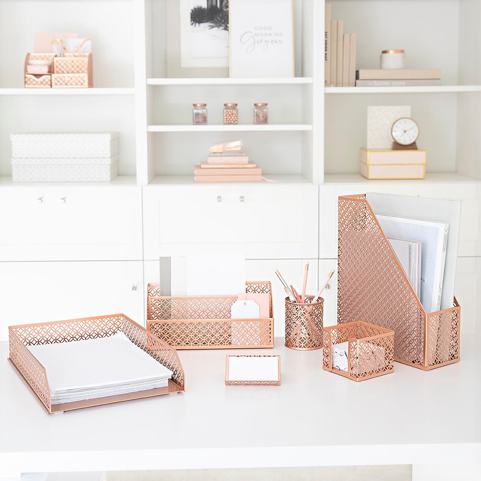
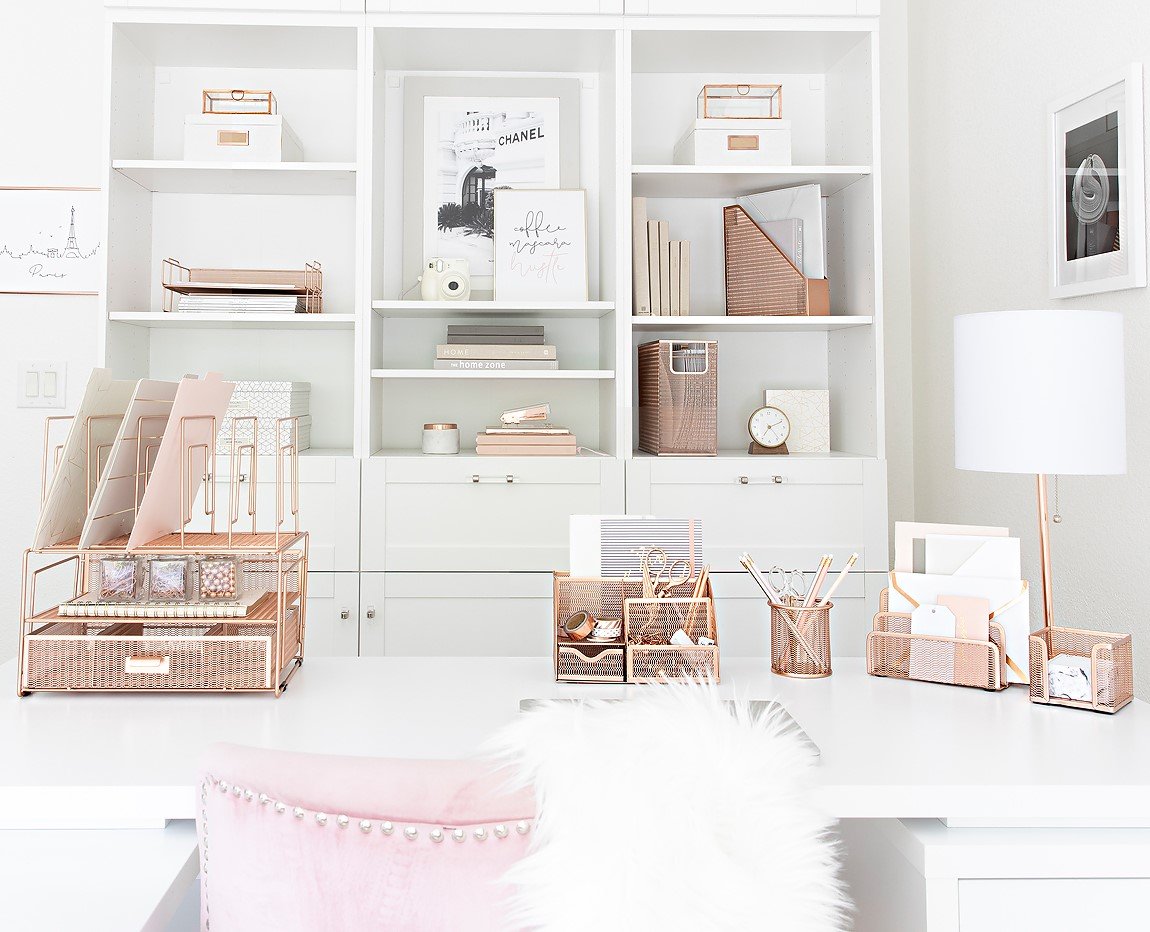
Your desk accessories are the finishing touch that pulls the whole room together. Imagine a stunning set of rose gold organizers sitting on a clean white desk—it instantly elevates the space with a sense of polished luxury. Or picture a vibrant pop of aqua from a matching letter tray and pen cup, energizing an entire corner of your office.
This isn't just about looking good; it's about creating a workspace that feels unified and intentional. There's a reason the home décor market is projected to hit US$128.6 billion by 2026. People are moving away from random pieces and toward curated collections that express a consistent visual identity. You can dig into some fascinating interior design market insights to see just how much this trend is shaping modern homes.
It all comes down to a simple, powerful idea:
A beautifully organized desk is a productive one. When your tools are stylish and color-coordinated, you transform clutter into a curated collection that perfectly blends form and function.
So, how do you make this happen? It’s much simpler than you think. The trick is to treat your organizational tools as a deliberate part of your design plan right from the start.
Start with a Set: Instead of picking up individual pieces here and there, go for a complete desk organizer set. It’s the fastest way to get a perfect color match and an immediate, professional look.
Create Contrast: Make your accessories pop by placing them on a neutral surface, like a white or wood-grain desk. A black mesh set on a light-colored desk, for instance, creates a bold, modern feel.
Echo Your Accent Wall: If you have an accent wall, choose accessories in a similar shade. This simple move creates a visual thread that ties the entire room together.
By focusing on these small but mighty details, you bring your vision to life in a tangible way. For even more inspiration, check out our guide to home office organization ideas for plenty of actionable tips.
Choosing the right colors for your home office can feel like a huge decision, but it shouldn't be a stressful one. Let's walk through some of the questions I hear most often from people just like you who are trying to get it right. Think of this as the final boost of confidence you need to create a space that’s not just beautiful, but a true powerhouse of productivity.
You've got the vision. Now it's time to iron out the details, clear up any doubts, and make sure your plan is a perfect fit for your room and your work style.
When you're working with a smaller space, light and airy colors are your best friend. Think soft whites, pale grays, or even a light sky blue. These shades are brilliant at making a room feel bigger, brighter, and way less cramped. They work by bouncing natural light around the room, creating an open, expansive vibe that gives you room to breathe and think.
But this doesn't mean your office has to be boring! You can still bring in those vibrant, energizing colors through your accessories without making the room feel smaller. Imagine a crisp white desk, but then you add the stunning pop of the Blu Monaco Aqua or Teal collections. It’s the perfect way to get that jolt of joyful color without overwhelming the space.
Stuck with landlord-beige walls? No problem. Renting just means you have to get a little more creative. The trick is to focus your color strategy on things you can easily add (and take with you when you leave). The single best place to start? Your desk.
Your desk is the command center of your office. When you dress it up with a cohesive color story, you instantly set the tone for the entire room—no paint required.
A complete Blu Monaco 5-piece organizer set in Rose Gold or Gold immediately establishes a chic, sophisticated theme. From there, you can weave your new color palette into other removable items:
Wall Art: A few large, dramatic prints or a curated gallery wall can do wonders for introducing your accent colors.
Area Rugs: A great rug doesn't just feel good underfoot; it can anchor the entire room and define your color scheme.
A Statement Chair: Why settle for a boring black chair? Choose one in a bold, uplifting color that makes you happy just looking at it.
Peel-and-Stick Wallpaper: Today’s removable wallpapers are a renter's dream. Use one to create a stunning feature wall behind your desk.
It doesn't need to be an identical match, but it should feel like it belongs. I like to think of a home office's style as a "cousin" to the rest of the house, not an identical "twin." You're aiming for a sense of flow and harmony as you move from one space to the next.
A simple way to do this is to borrow a color from a nearby room and use it as an accent in your office. For example, if your living room is full of warm neutrals and earthy tones, designing your office with a deep sage green and natural wood finishes will feel distinct, yet totally in sync. This approach gives your workspace its own unique identity while making it feel like a thoughtfully integrated part of your home.
Ready to bring your vision to life? Explore the curated collections at Blu Monaco and find the perfect accessories to complete your home office transformation. Shop stylish desk organizer sets now.


